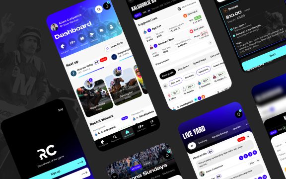
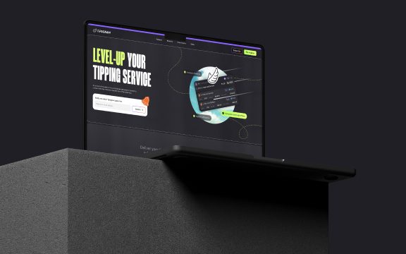
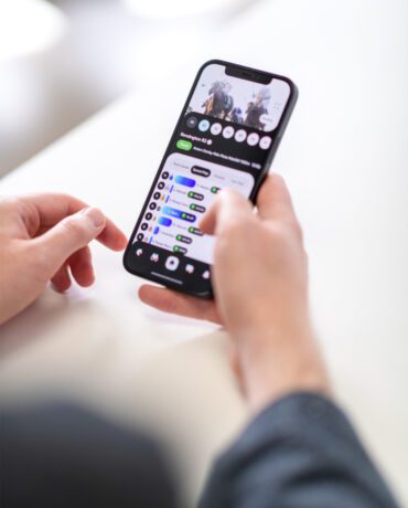
The debate over dark mode versus light mode is a bit like arguing about pineapple on pizza – everyone has an opinion, and nobody’s opinion is wrong (except the anti-pineapple people, but I digress). Personally, I’m a light mode person. It’s clean, bright, and doesn’t make me feel like I’ve entered The Matrix. That said, there’s always been this lingering voice in my head that tells me, “Real engineers use dark mode.” What an identity crisis this poses for me. But then again, if you’re reading this article on our website (which you are because it doesn’t exist anywhere else), you’ll notice that our site is designed in dark mode so clearly I have a foot in each camp!
If you’re thinking of scrolling to the bottom of the article for a decisive answer – sorry, you won’t find it. I’m personally going to maintain this is a classic case of “horses for courses.” Ideally, your app would offer both options to cater to different preferences. Still, there are some objective pros and cons worth exploring, along with tips for choosing the best path forward.
The case for dark mode
The People Love It
Dark mode has a bit of a cult following. Research suggests that up to 82% of smartphone users prefer it—though let’s be honest, it might just be the vocal ones on Twitter. For many, dark mode feels easier on the eyes, especially in low-light settings, and it’s often seen as a sleeker, more modern look.
Battery Efficiency
If you’re using a device with an OLED or AMOLED screen, dark mode can extend battery life—sometimes by as much as 47% at full brightness. The savings are less dramatic at lower brightness levels, but hey, every little bit counts. If your app is aimed at users who spend hours on their devices, this is a big win.
Night Owls Rejoice
For apps that are used predominantly at night—think productivity tools or doom-scrolling companions—dark mode is easier on the eyes (and probably your circadian rhythm).
The case for light mode
Bright and Friendly
Light mode can feel more approachable and natural, particularly in well-lit environments. It’s a bit like being in a sunny room versus a moody basement. Some users (like me) just feel more comfortable with a bright, clean interface.
It’s Easier to Get Right
From a design perspective, light mode is often the path of least resistance. Elements like typography and colour contrast generally require less adjustment compared to dark mode, which can quickly go from “modern chic” to “staring into a black hole” if not executed well.
What about both?
In a perfect world, your app would offer both light and dark modes. Once considered a premium feature, it’s now table stakes for many apps, and users have come to expect the option. That said, implementing both requires extra time, testing, and budget – something startups might not have the luxury to accommodate.
If you’re working with limited resources, here’s the good news: offering both modes isn’t a strict expectation for most users, especially in the early stages. Unless accessibility is a major priority for your audience, you can likely save this for post-MVP development.
Designing for both modes well
If you do decide to support light and dark modes, here are some tips to ensure your app looks cohesive:
- Choose Colours Carefully
Don’t just adapt your existing palette without scrutiny – designing for both modes requires thoughtful colour choices. Ensure your brand colours remain distinct and visually appealing on both light and dark backgrounds. Adjustments may be needed to maintain balance and consistency. - Check Contrast Ratios
Run all text, icons, and interactive elements through a contrast checker to ensure they meet WCAG accessibility standards. This ensures readability for all users, regardless of the mode they’re using or their visual capabilities. - Maintain Consistency Across Modes
While light and dark modes have inherently different aesthetics, your app should feel like the same product in either setting. Ensure key elements like typography, spacing, and imagery translate seamlessly between modes. - Prioritise Testing
Test your designs extensively in both modes under different conditions—bright daylight, dim rooms, and everything in between. This helps catch any inconsistencies or usability issues before your app reaches users.
What say you..
In the case of light mode vs dark mode, the Pink Panda jury is hung. The answer depends on your audience, your app’s purpose, and, of course, your resources. Dark mode is undeniably popular and can boost battery efficiency, but light mode remains a safe and reliable choice.
For startups, my advice is simple: focus on nailing one mode first. A cohesive, functional design in light or dark mode is better than a half-baked attempt at both. And if you have the resources to offer both down the line, even better. Until then, keep it simple, keep it functional, and remember—no one’s choosing your app based solely on whether it’s dark or light. Probably.

