For those of you reading this and thinking, “Who cares?” – fair. We’re just a small digital agency doing our thing. But indulge me for a moment as I share the journey behind our recent brand refresh – because it runs a little deeper than just a shiny new logo.
Our birth story
When Pink Panda first launched, my co-founder at the time and I were two guys with big ideas to take on the digital world and an oddball name. So where did “Pink Panda” come from, you ask (or not, but I’ll pretend you did)? Well, it all started with a fascination for Harris Real Estate’s bold re-brand which must’ve taken place some time around 2014. Their bold, hot pink signs were almost impossible to miss as you drove past their homes for sale and we loved how effortlessly they stood out. We wanted to capture that same attention-grabbing spirit – so “Pink” was a non-negotiable.
As for “Panda”, you ask (again, I’ll pretend you did)? There seems to be, or certainly at the time there was, a trend amongst digital and creative agencies where their company name would be derived from a colour followed by an animal. A highly imaginative formula, I know. Thus, Pink Panda was born since a little alliteration never hurt. I still question whether “Panda” was the right choice of animal since most boomers, even within my own family, to this day think the business is called “Pink Panther”.
Early years in the wild
In the beginning, Pink Panda was all about bold creativity. Our first logo featured a clip-art style panda head, paired with a quirky typeface. We splashed bright pink everywhere we could. It was everything but subtle however that was the point. We wanted to be loud, playful, and unmissable.
Whether our visual identity played a role in attracting some of our early clients in the arts and entertainment industry or whether this early success was complete coinicidence, I’ll never know. But I feel that our identity was positioned as a natural fit for those industries, and we leaned into it. But as we grew and started attracting clients from other sectors – non-profits, corporates, and more – I felt that we needed to pull back our branding needed to evolve. I started to fear that our quirkiness was alienating a more professional type of client and change was needed. On the other hand, our capabilities were improving, team was growing, and I felt that the way we presented didn’t allow us to operate at a price-point that was truly represented our capabilities. Whether this was a rational fear or not is another story.
Shedding our spots
Our second iteration was a complete departure from our initial identity. Out went the panda head, in came a sleek, minimalist type-based logo. The vibrant pink we had used with such high saturation took a back seat, and was used sparingly as a highlight colour. We wanted to look polished, sophisticated, and (frankly) a little more corporate. The goal was quite simple: attract bigger clients and show that we were credible players in the digital space.
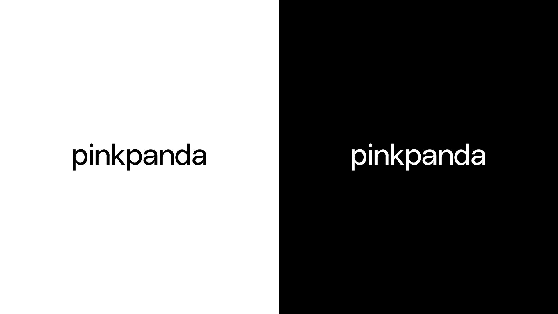
Did it work? At the end of the day, who knows. The business continued growing, we landed bigger clients and established ourselves as a trustworthy agency that was able to produce good digital outcomes. But would we have gone on to do so under our old identity, or a new one which was as bold and brash as our original.. possibly so.
Embracing our inner Panda
Fast forward to late 2024, I began to reflect on the business, our brand and the web and app development landscape more holistically. While our current identity had its merits, it just wasn’t us. Polished? Sure. Professional? Absolutely. But in a fiercely competitive market, we needed to focus on what truly sets us apart. I started to realise that it’s not about trying to out-corporate the corporate agencies – it’s about staying true to what makes us different.
We’re a boutique agency. Nimble yet powerful. Creatives to the core and let’s be honest – software engineering nerds. It was time to own that. Time to express our unique blend of creativity and technical expertise in our own way, whilst demonstrating the high level of craftsmanship we bring to every project.
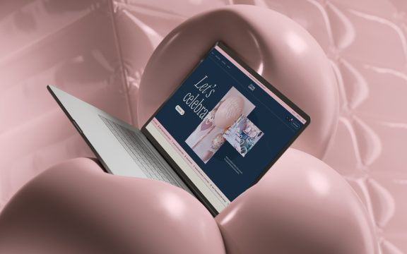
So, we leaned back into both the “Pink” and “Panda” in Pink Panda, reintroducing personality and warmth to our brand. We brought back a dominant use of pink, but in a more refined manner, establishing a duotone colour palette, limited to simply a pastel pink and black for maximum contrast. Alongside this, we introduced lush tropical elements – greenery, foliage, and bamboo – adding depth and a connection to our panda identity. And because we’re all about doubling down on the panda, we introduced pink, panda-fur-shaped blobs that now gently move and warp in the background fo our website, creating a dynamic, tactile appeal throughout the site.
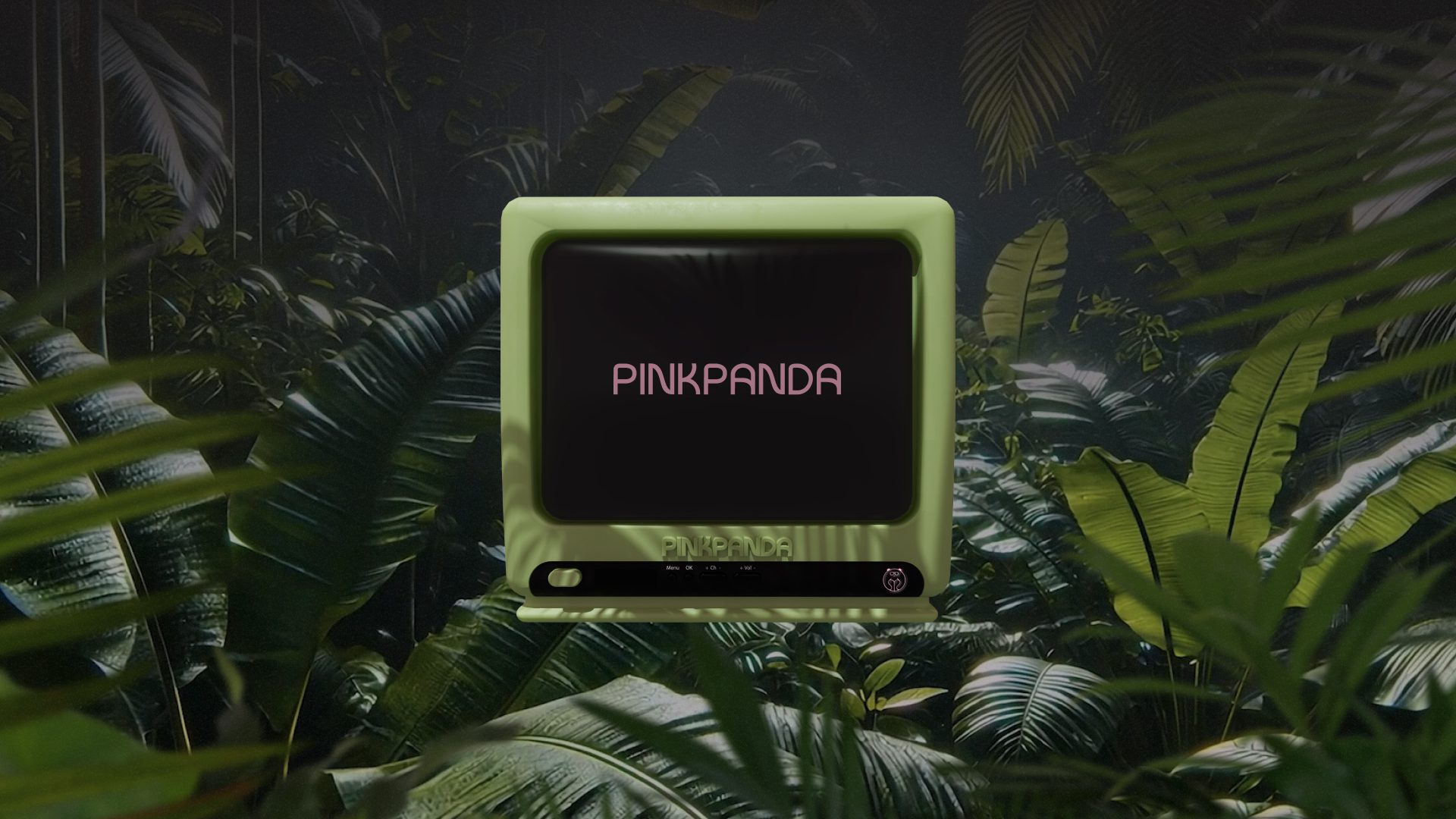
The logo itself remains typography-based but now carries a subtle 70s/retro influence. Why retro? Because it offered an opportunity to bring an unexpected sense of style and playfulness to the mix. Pairing vintage-inspired type with tropical assets created a look that’s both nostalgic and fresh, with a touch of Miami Vice coolness. To extend this retro vibe, we incorporated elements like an old-school TV motif and a subtle static texture into our website background, adding layers of visual interest and deliberate imperfectness.
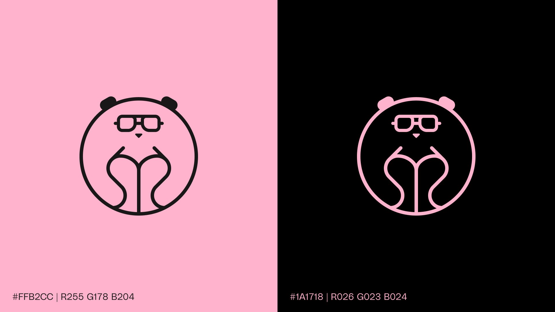
Our in-house designers created a minimal panda logomark, complete with retro spectacles, to use sparingly where it felt appropriate. The logomark feels cheeky yet sophisticated—a perfect reflection of our brand’s balance between creativity and professionalism.
And then, for something completely different, we created a standalone visual asset: an AI-generated panda sporting a retro turtleneck and massive 70s aviators. It’s an unapologetically fun nod to our personality and a reminder not to take ourselves too seriously. While it’s not part of the core logo, this panda is already becoming a bit of a mascot in its own right, adding a touch of “wildness” and flair to our visual storytelling.

This new identity is more than just a design update – it’s a true reflection of who we are. We’ve embraced our roots, blending boutique charm with bold creativity, and found a way to stand out. Not by conforming to a corporate mould, but by fully leaning into what makes Pink Panda unique.
Why it matters
We’re a small team with big ideas, and we thrive on creating exceptional digital experiences for our clients. Our brand should reflect that energy—and now, we think it does.
So, if you’ve noticed our new look and are wondering what’s behind it, there you have it. And if you didn’t notice – no hard feelings. We’re just happy to keep doing what we do best: helping our clients thrive, one website or app at a time.
